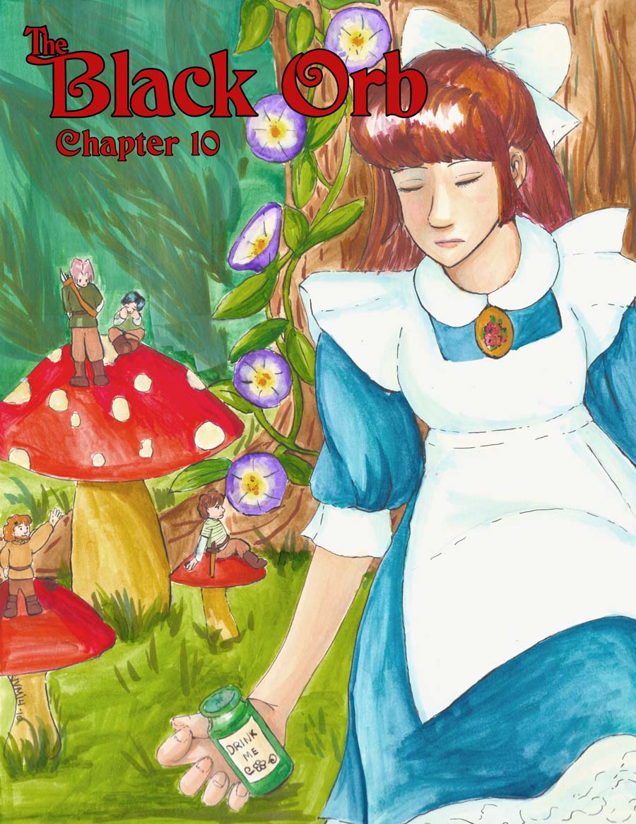
Wow, chapter 10 already.
I actually like how this color page came out. It's a mix of watercolor and copic markers with ink outlining. My problems with water color in the past has been achieving the right opacity of color, and my technique was poor (I always used too much water and rushed, with sloppy-looking results). Since the illustration class I took this summer, I've been slowly working on small things here and there, trying to get better.
Mr. B and I went to the Norman Rockwell museum yesterday, and they had a special exhibit on one of my favorite painters, Edward Hopper, but specifically his commercial illustrations. The technique he seemed to use in the was a thick watercolor with ink detailing over it. I though it looked almost like animation cells, so I resolved to try it a bit when I got home. I started the draft on watercolor paper, but it wasn't the right texture. I discovered that actually vellum bristol board works pretty good with both watercolor and marker (the paper doesn't pucker too much, as long as you're conservative with water use).
I don't normally write this much, do I?


Now that picture does remind me of a few things…except for the obvious reference to Carroll’s infamous story about mad people (cause let’s face it, none of the people there had all their marbles together ;P), it reminds me of that song ‘Living next door to Alice’. I don’t have to explain that one, do I? 😀
Though where are the ‘Eat me’-Cookies? 😉
Nice job on this illustration 🙂